Matt, Jack, and Anastasia are in Reykjavik this week, along with Genève Campbell of the Berkman Center for Internet and Society, for the annual meeting of the International Internet Preservation Consortium. We’ll have lots of details from IIPC coming soon, but for this first post we wanted to share some of the things we’re noticing here in Reykjavik.
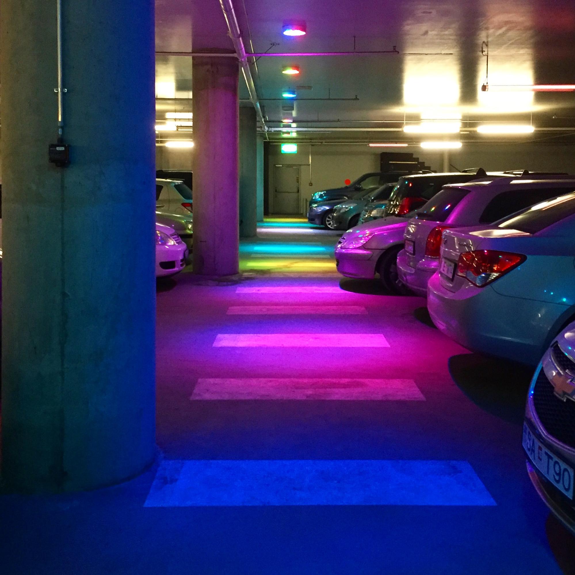
[Genève] Nothing in Reykjavik seems to be empty space. There is always room for something different, new, creative, or odd to fill voids. This is the parking garage of the Harpa concert hall. Traditional fluorescent lamps are interspersed with similar ones in bright colors.
[Jack] I love how many ways there are to design something as simple as a bathroom. Here are some details I noticed in our guest house:

Clockwise from top left: shower set into floor; sweet TP stash as design element; soap on a spike and exposed hot/cold pipes; toilet tank built into wall.
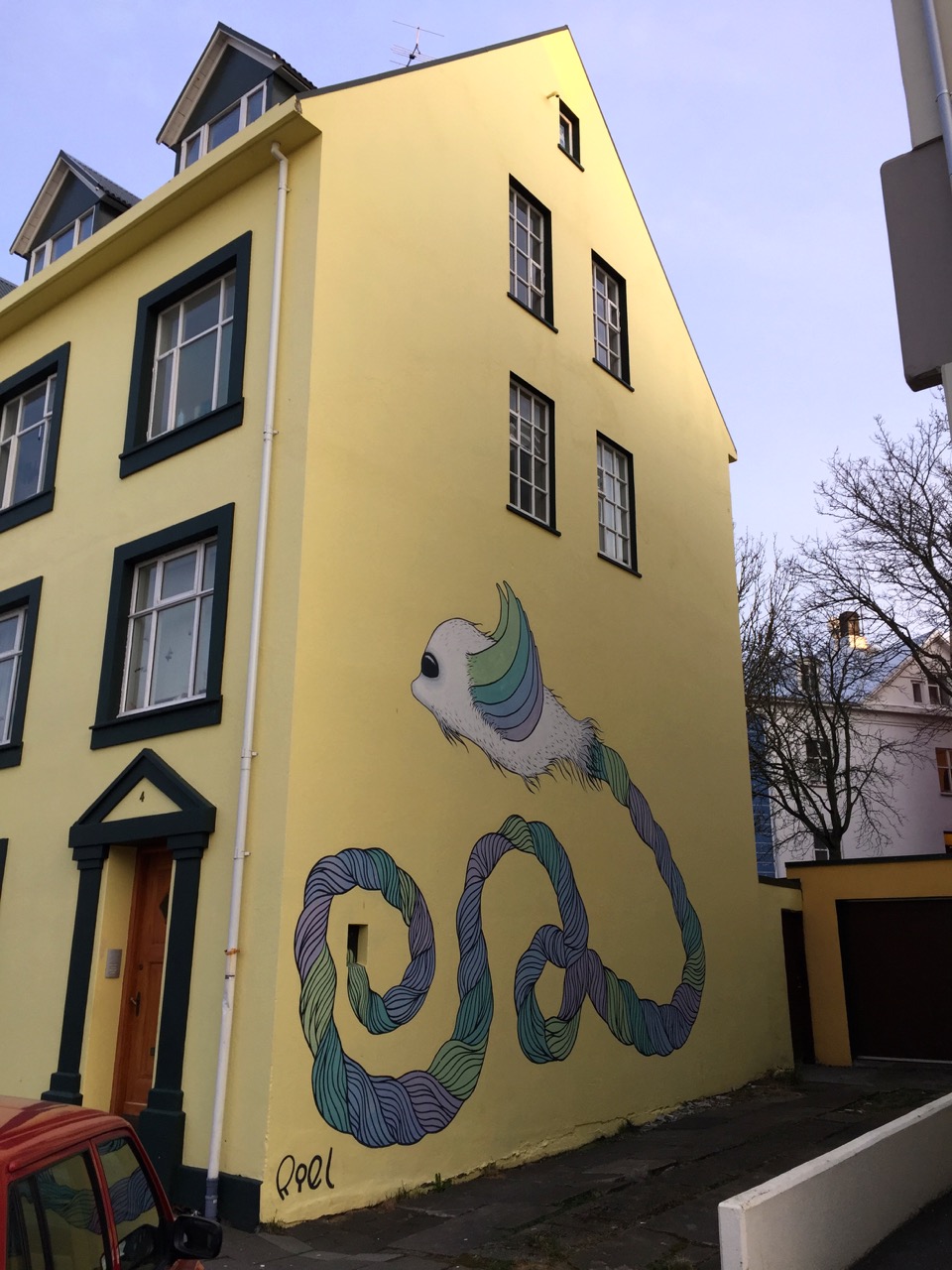
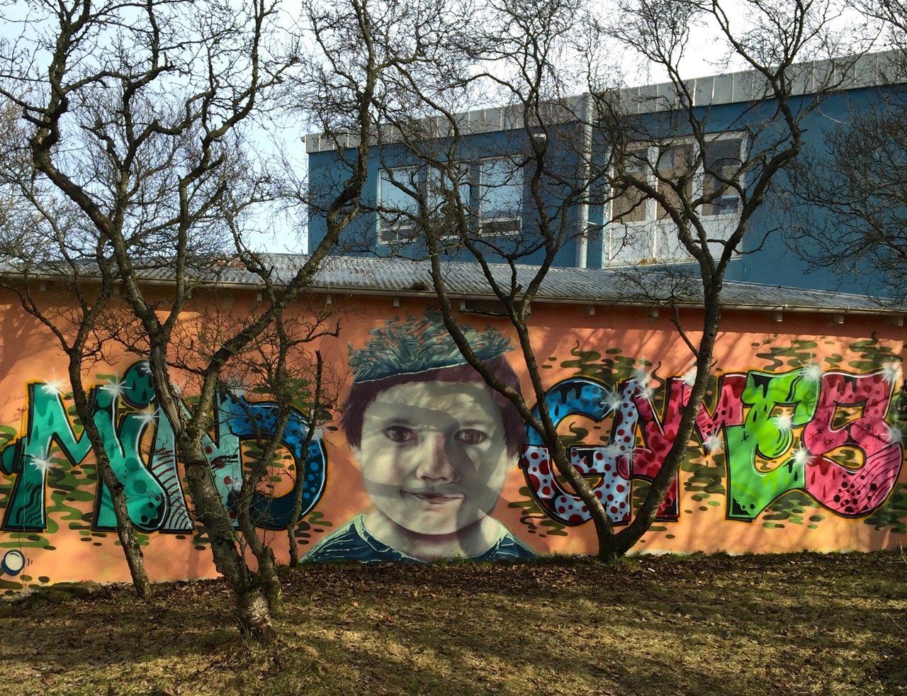
[Matt] Walking around the city is colorful and delightful. Spotting an engaging piece of street art is a regular occurrence. A wonderful, regular occurrence.
[Anastasia] After returning from Iceland for the first time a year ago, I found myself missing something I don’t normally give much thought to: Icelandic money is some of the loveliest currency I have ever seen.
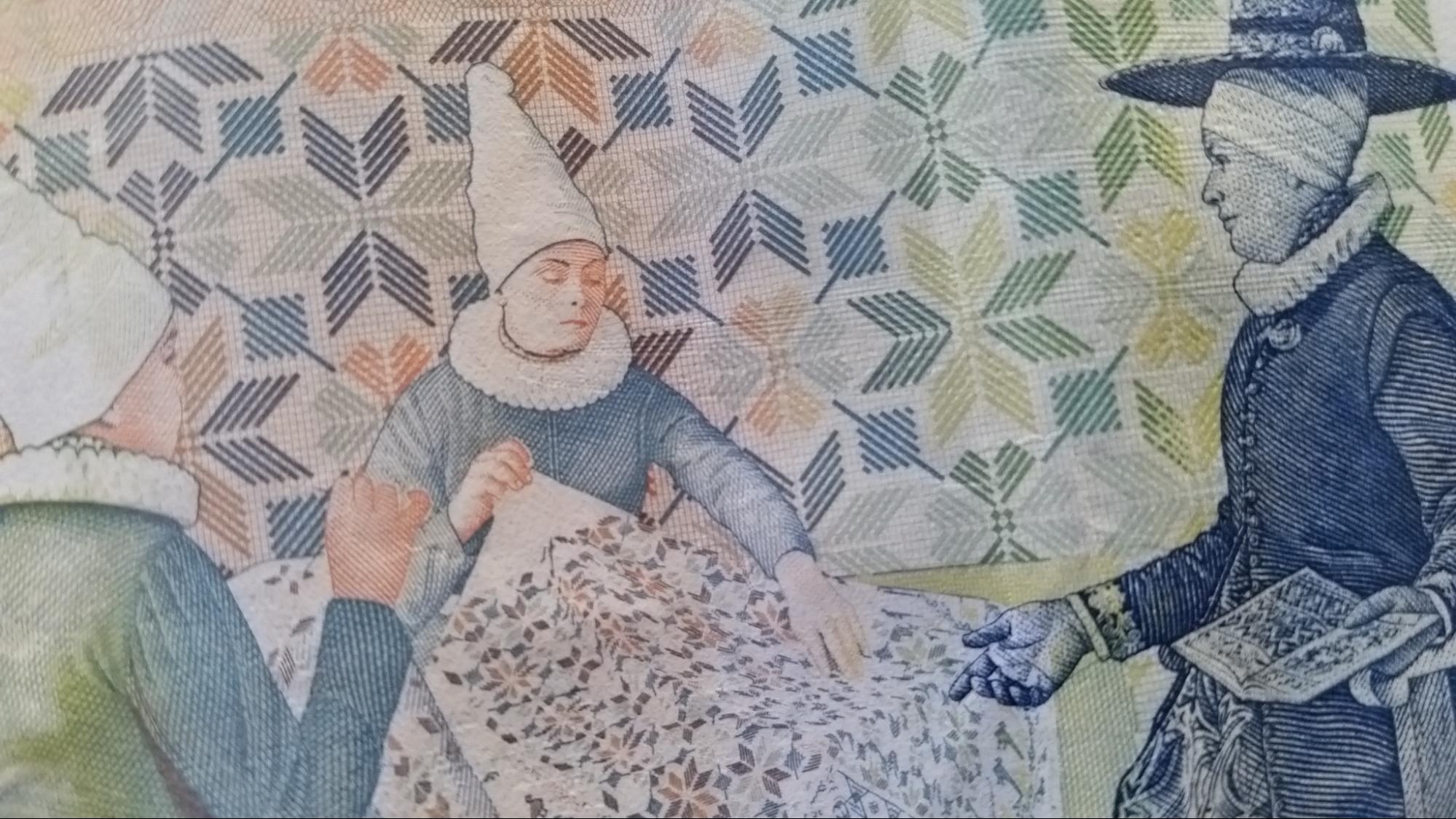
The banknotes are quite complex artistically, and yet every denomination abides by thoughtful design principles. Each banknote’s side shows either a culturally-significant figure or scene. The denomination is displayed prominently, the typography is ornate but consistent. The colors, beautiful.
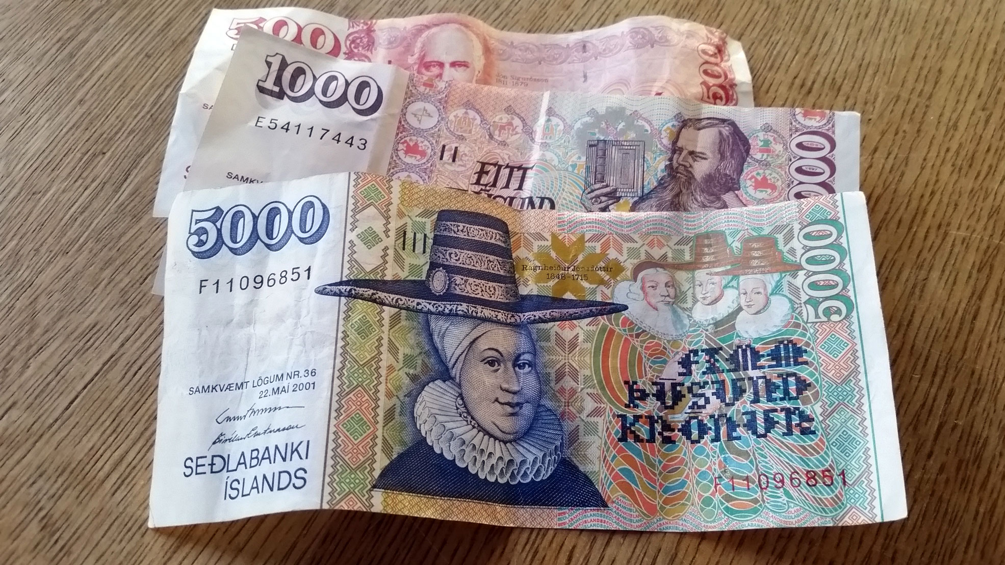
But what trumps the aesthetics is the banknotes’ dimensions. Icelandic paper money is sized according to amount: the 500Kr note is smaller than the 1000Kr note, which in turn is outsized by the 5000Kr note. This is incredibly important — it allows visually impaired people to move about more freely in the world.
In comparison, our money looks silly and our treasury department negligent, as it is impossible to differentiate the values by touch alone. And, confoundingly, there don’t seem to be movements to amend this either: in 2015 the department made “strides” by announcing it would start providing money readers, little machines that read value to people who filled out what I’m sure is not a fun amount of paperwork, instead of coming up with a simple design solution.
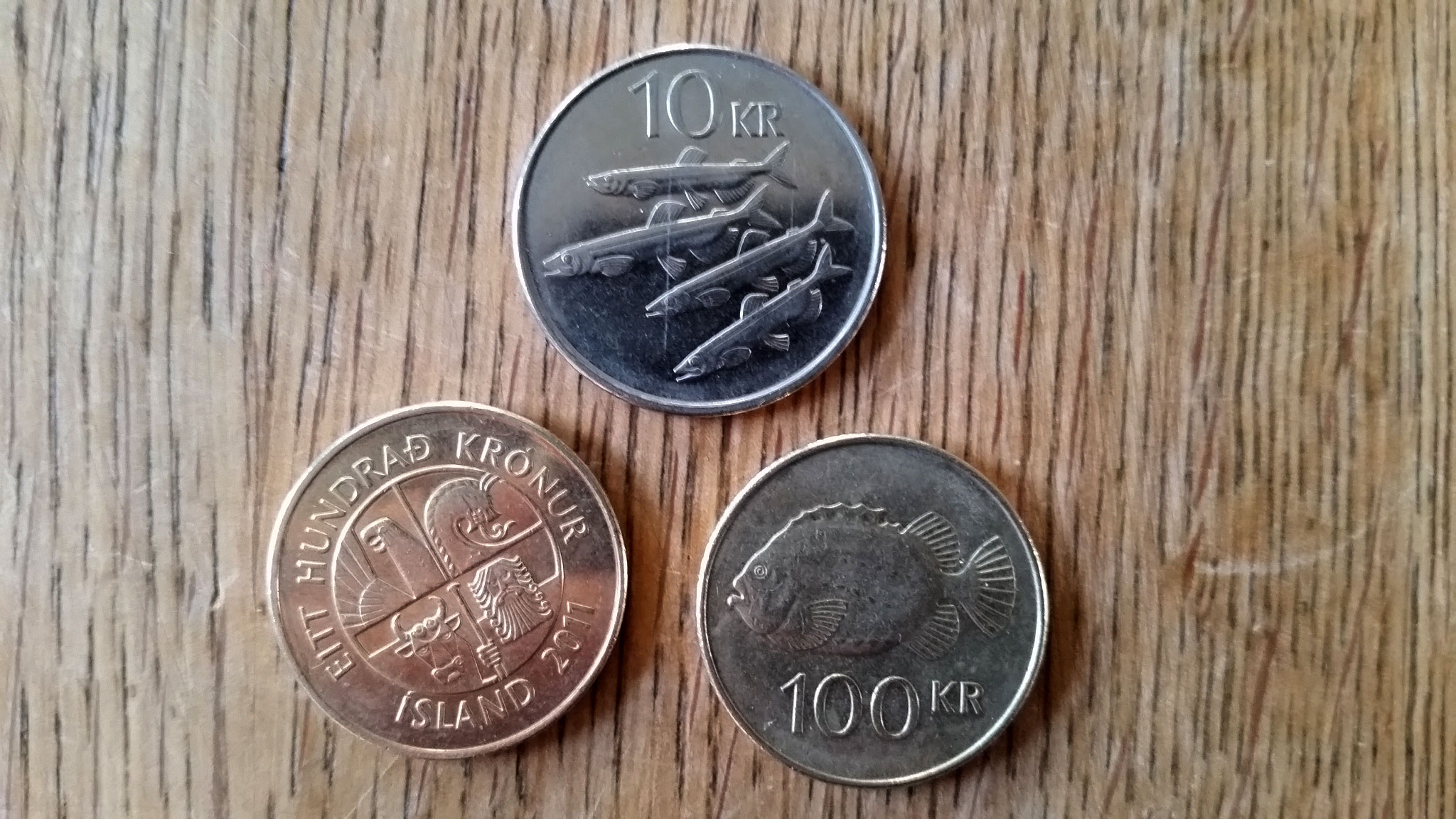
The coins are a different story. When I first arrived the clunky coins were a happy surprise — they’re delightfully weighty (maybe even a little too bulky for normally non-cash-carrying types), adorned with beautifully thoughtful designs. On one side of each of the coins (gold or silver), the denomination stands out in large type along with local sea creatures: a big Lumpfish, three small Capelin fish, a dolphin, a Shore crab.
On the reverse side the four great guardians of Iceland gaze intensely. They are the dragon (Dreki), the griffin (Gammur), the bull (Griðungur), and the giant (Bergrisi), that each protected Iceland from Denmark invasion in turn, according to the Saga of King Olaf Tryggvason. On the back of the 1 Krona, only the giant stands, commanding.
And that’s it. No superfluous information. No humans, either, only mythology and fish.
Returning home is good things, but sometimes it also means re-entering a world where money is just sad green rectangles (and oddly sized coins) full of earthly men.