Authors:
Published:
On off moments over this summer, Annie and I have put together our new site. You know, splashed some water on our face.
That’s what you’re looking at. LiL, freshened up.
The goals:
- Freshen up our look
- Mobile-friendly
- Make it really easy to add stuff, but no big-time CMS nonsense
- Fun
- Shareable
1) We’d built the original site about two years ago—a long time in internet time. It worked, but it was a bit heavy and very fixed. We wanted to lighten up things a bit. Annie ended up on 2x4’s website and that started everything off.
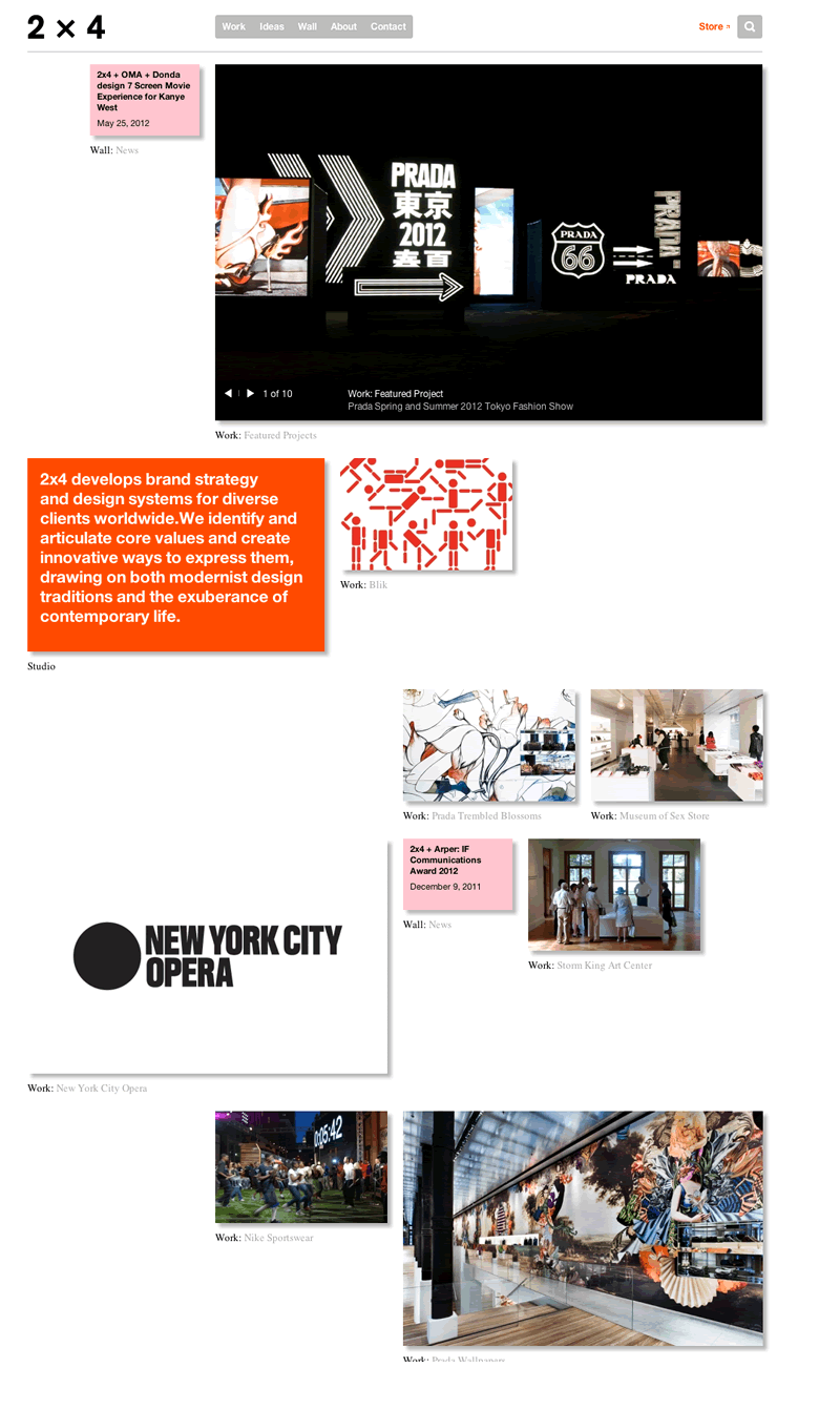 As you’ll no doubt see, our homepage is HEAVILY inspired by 2x4’s work. Ours is less refined, but gets at the general idea of a long pane of scattershot (but underlying grid adhering) images.
2) By now, a lot of the web has been Twitter Bootstrapped—folks everywhere have built their websites using Twitter’s recently open source web framework, Bootstrap. There are a lot of reasons for this, but the primary one is packaging. They’ve thrown in nice buttons, cross-browser fixes, and a good responsive grid to make your site work on mobile. The elegant mobile handling is really why we started on this framework.
3) We wanted the site to be able to change a lot. And frequently. At the same time, neither of us wanted to muck around in the CMS worlds of drupal, etc. It’s just too complicated. So we took the wordpress-as-CMS route. Each project gets its own wordpress “page” that we link to. Easy to update, manage, etc. We restyled a great, free wordpress theme called WordPress Bootstrap by 320 Press to make the blog look a lot like every other page. That way a blog page (which is easy to author) can double as a project page and look pretty natural (nice hack Paul!).
Even cooler, Annie came up with a clever system to add all content—people, projects, etc.—info into one, easy-to-understand file (we’ve called it ingredients.json). And then those assets ripple through all the pages. She’ll go into it in another post.
4) Everybody seemed to like the mouse-over about us page from our last site. So we took that and ran with it. Some, not all, images come to life with a hover. And some more than others—Jessica’s been dabbling in animating some .gif’s. The hover state is not one that ports to mobile. Any ideas port the fun to these devices?
5) I’d say this is the big point, we wanted to give our site away. Take it. Run with it. Modify it. Whatever. I got obsessed with the idea of sharing sites whole hog. The site meets our needs as a lightweight wordpress CMS. Wordpress was complicated enough. Maybe you find yourself in that position—or just want a pretty simple site that makes hovering things fun. It’s on github. It ain’t all polished and buffed under the hood, and lot’s more documentation to come, but our site’s out. Make it your site, or improve it so we can add your changes to our site.
The site will take on more and more of its own character over time, but we’ve rebooted. And it seems like it’s time.